
climatecrisis
The Best Data Viz and Infographics on Climate Change Facts – The data used was from the NASA GISS, Land Ocean Temperature Index. This type of visualization borders on contemporary art and is the kind of thing that should go viral.

Climate Trace – AI-powered global emissions (by country and sector)

Check out the Guardian’s Climate Data Dashboard


Every Country Has Its Own Climate Risks – see NYT 3D Map and explorer your country, region…

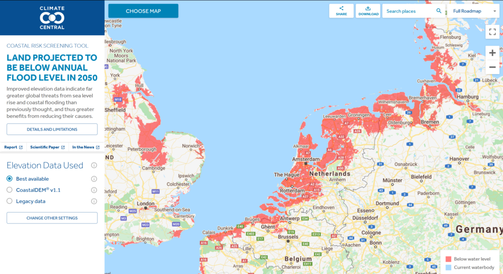
Climate Central has a Coastal Risk Screening Tool – Land projected to be below annual flood level in 2050
Climate Reanalyzer, an interactive website for visualizing an array of climate and weather models and station data.
Climate Futures and Climate Reanalyzer are initiatives of the Climate Change Institute (CCI) at the University of Maine.

9 TippingPoints that could be triggered by ClimateChange – CarbonBrief

NASA’s Jet Propulsion Laboratory has an overview of the already observable effects on the environment of global climate change. Also see the Images of Change Gallery!
Consequences for Europe and effects on Nature (by WWF)


McKinsey & Company – How companies can adapt to climate change

Bloomberg Data Dash: A (depressing) Live Climate Scoreboard for the World

Net Zero Tracker by the Energy & Climate Intelligence Unit – Net Zero Emissions Race

The online Global Calculator tool puts you in charge of the world’s energy, land and food system from now until 2050 through 40 “levers and visualizes their impact on the global climate.

Yale Climate Connections – 20 climate studies from 2020 – These free studies and reports contain the latest authoritative information about food security, U.S. flood risks, renewable energy, and much more.

